Download the notebook here!
Interactive online version: ![]()
Demo
This notebook provides a high-level overview of the Online Retail Simulator package and its capabilities.
What is Online Retail Simulator?
A Python package for generating synthetic e-commerce data for:
Testing and demos without exposing real business data
ML model training with realistic retail patterns
A/B test simulation and experimentation
Teaching analytics and data science concepts
Key Capabilities
Rule-based generation: Fast, configurable synthetic data
ML-based synthesis: Learn patterns from real data (optional SDV integration)
Reproducible results: Seed control for deterministic output
8 product categories: Electronics, Books, Clothing, and more
Funnel metrics: Impressions, visits, cart adds, orders
Setup
First, let’s install the package (if running in Colab) and import the necessary libraries.
[1]:
# Uncomment if running in Google Colab
# !pip install online-retail-simulator matplotlib seaborn
[2]:
import pandas as pd
import matplotlib.pyplot as plt
import seaborn as sns

from online_retail_simulator import simulate, load_job_results

# Set plot style
sns.set_theme(style="whitegrid")
plt.rcParams["figure.figsize"] = (10, 6)
Generate Sample Data
We’ll generate 30 days of synthetic sales data with a simple configuration.
[3]:
import os

# Run simulation using config file
config_path = os.path.join(os.path.dirname(__file__) if "__file__" in dir() else ".", "config_demo.yaml")
job_info = simulate(config_path)

# Load results
results = load_job_results(job_info)
products_df = results["products"]
metrics_df = results["metrics"]

print(f"Generated {len(products_df)} products")
print(f"Generated {len(metrics_df)} metrics records")
Generated 100 products
Generated 3000 metrics records
Exploring the Generated Data
Let’s look at the structure and contents of our synthetic dataset.
[4]:
# Preview the metrics data
print(f"Date range: {metrics_df['date'].min()} to {metrics_df['date'].max()}")
print(f"Categories: {metrics_df['category'].nunique()}")
print(f"Total revenue: ${metrics_df['revenue'].sum():,.2f}")
print()
metrics_df.head(10)
Date range: 2024-11-01 to 2024-11-30
Categories: 8
Total revenue: $110,511.49
[4]:
| product_identifier | category | price | date | impressions | visits | cart_adds | ordered_units | revenue | |
|---|---|---|---|---|---|---|---|---|---|
| 0 | B1P4DZHDS9 | Electronics | 686.37 | 2024-11-01 | 0 | 0 | 0 | 0 | 0.00 |
| 1 | B1SE4QSNG7 | Toys & Games | 80.75 | 2024-11-01 | 100 | 16 | 3 | 3 | 242.25 |
| 2 | BXTPQIDT5C | Food & Beverage | 42.02 | 2024-11-01 | 0 | 0 | 0 | 0 | 0.00 |
| 3 | B3F1ZMC8Q6 | Food & Beverage | 33.42 | 2024-11-01 | 0 | 0 | 0 | 0 | 0.00 |
| 4 | B2NQRBTF0Y | Toys & Games | 27.52 | 2024-11-01 | 25 | 3 | 0 | 0 | 0.00 |
| 5 | B0OL6NCQ2G | Health & Beauty | 77.66 | 2024-11-01 | 50 | 7 | 1 | 0 | 0.00 |
| 6 | BELIUY7PF3 | Books | 33.79 | 2024-11-01 | 10 | 1 | 0 | 0 | 0.00 |
| 7 | BZ13P24N6K | Toys & Games | 38.11 | 2024-11-01 | 0 | 0 | 0 | 0 | 0.00 |
| 8 | BY3H2A222X | Clothing | 40.85 | 2024-11-01 | 200 | 34 | 9 | 1 | 40.85 |
| 9 | BZUQSUBFIE | Books | 49.04 | 2024-11-01 | 10 | 1 | 0 | 0 | 0.00 |
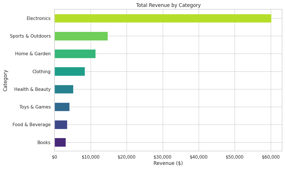
Revenue by Category
How is revenue distributed across product categories?
[5]:
# Revenue by category
category_revenue = metrics_df.groupby("category")["revenue"].sum().sort_values()

fig, ax = plt.subplots(figsize=(10, 6))
category_revenue.plot(kind="barh", ax=ax, color=sns.color_palette("viridis", len(category_revenue)))
ax.set_xlabel("Revenue ($)")
ax.set_ylabel("Category")
ax.set_title("Total Revenue by Category")
ax.xaxis.set_major_formatter(plt.FuncFormatter(lambda x, p: f"${x:,.0f}"))
plt.tight_layout()
plt.show()
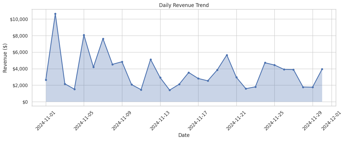
Daily Sales Trend
How do sales vary over time?
[6]:
# Daily sales trend
daily_sales = metrics_df.groupby("date").agg({
    "ordered_units": "sum",
    "revenue": "sum"
}).reset_index()
daily_sales["date"] = pd.to_datetime(daily_sales["date"])

fig, ax = plt.subplots(figsize=(12, 5))
ax.plot(daily_sales["date"], daily_sales["revenue"], marker="o", linewidth=2, markersize=4)
ax.fill_between(daily_sales["date"], daily_sales["revenue"], alpha=0.3)
ax.set_xlabel("Date")
ax.set_ylabel("Revenue ($)")
ax.set_title("Daily Revenue Trend")
ax.yaxis.set_major_formatter(plt.FuncFormatter(lambda x, p: f"${x:,.0f}"))
plt.xticks(rotation=45)
plt.tight_layout()
plt.show()
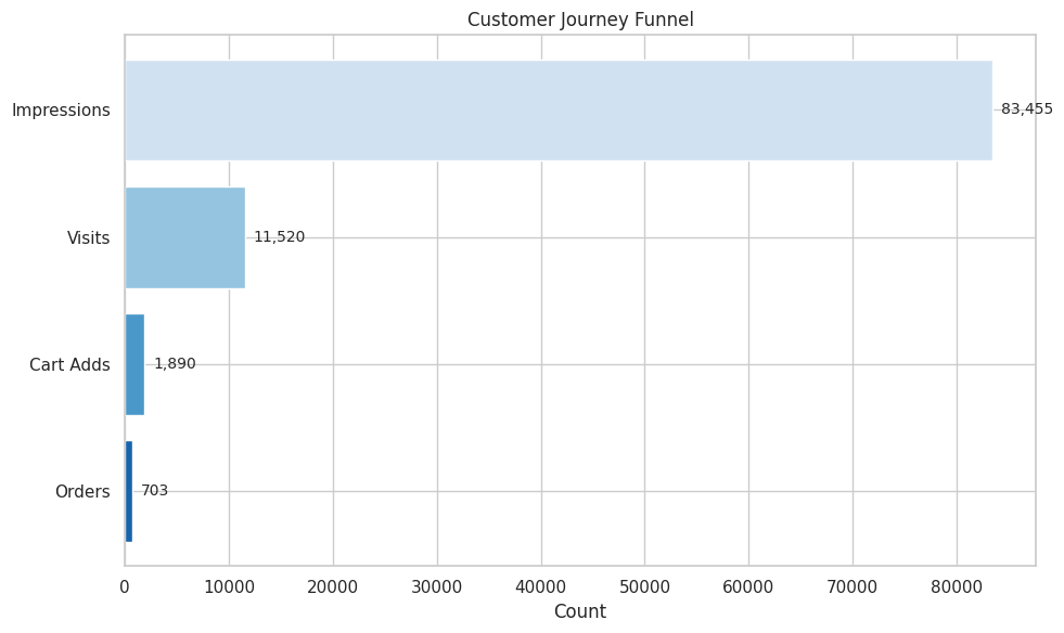
Conversion Funnel
The data includes full customer journey metrics: impressions, visits, cart adds, and orders.
[7]:
# Conversion funnel
funnel_data = {
    "Impressions": metrics_df["impressions"].sum(),
    "Visits": metrics_df["visits"].sum(),
    "Cart Adds": metrics_df["cart_adds"].sum(),
    "Orders": metrics_df["ordered_units"].sum()
}

stages = list(funnel_data.keys())
values = list(funnel_data.values())

fig, ax = plt.subplots(figsize=(10, 6))
colors = sns.color_palette("Blues_r", len(stages))
bars = ax.barh(stages[::-1], values[::-1], color=colors)
ax.set_xlabel("Count")
ax.set_title("Customer Journey Funnel")

# Add value labels
for bar, val in zip(bars, values[::-1]):
    ax.text(val + max(values) * 0.01, bar.get_y() + bar.get_height() / 2,
            f"{val:,}", va="center", fontsize=10)

# Add conversion rates
print("Conversion Rates:")
print(f"  Impressions → Visits: {values[1]/values[0]*100:.1f}%")
print(f"  Visits → Cart Adds: {values[2]/values[1]*100:.1f}%")
print(f"  Cart Adds → Orders: {values[3]/values[2]*100:.1f}%")
print(f"  Overall (Impressions → Orders): {values[3]/values[0]*100:.2f}%")

plt.tight_layout()
plt.show()
Conversion Rates:
  Impressions → Visits: 13.8%
  Visits → Cart Adds: 16.4%
  Cart Adds → Orders: 37.2%
  Overall (Impressions → Orders): 0.84%
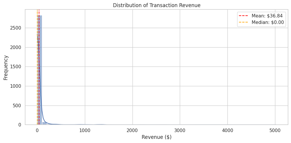
Descriptive Analysis
Let’s dive deeper into the data patterns.
Distribution of Order Values
[8]:
# Distribution of revenue per transaction
fig, ax = plt.subplots(figsize=(10, 5))
sns.histplot(metrics_df["revenue"], bins=50, kde=True, ax=ax)
ax.set_xlabel("Revenue ($)")
ax.set_ylabel("Frequency")
ax.set_title("Distribution of Transaction Revenue")
ax.axvline(metrics_df["revenue"].mean(), color="red", linestyle="--", label=f"Mean: ${metrics_df['revenue'].mean():,.2f}")
ax.axvline(metrics_df["revenue"].median(), color="orange", linestyle="--", label=f"Median: ${metrics_df['revenue'].median():,.2f}")
ax.legend()
plt.tight_layout()
plt.show()
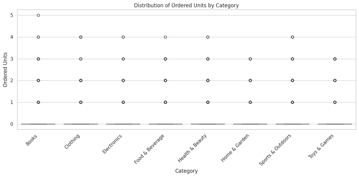
Units per Order by Category
[9]:
# Units per order by category
fig, ax = plt.subplots(figsize=(12, 6))
order = metrics_df.groupby("category")["ordered_units"].median().sort_values().index
sns.boxplot(data=metrics_df, x="category", y="ordered_units", order=order, palette="viridis", ax=ax)
ax.set_xlabel("Category")
ax.set_ylabel("Ordered Units")
ax.set_title("Distribution of Ordered Units by Category")
plt.xticks(rotation=45, ha="right")
plt.tight_layout()
plt.show()
/tmp/ipykernel_3256/1803871912.py:4: FutureWarning:

Passing `palette` without assigning `hue` is deprecated and will be removed in v0.14.0. Assign the `x` variable to `hue` and set `legend=False` for the same effect.

  sns.boxplot(data=metrics_df, x="category", y="ordered_units", order=order, palette="viridis", ax=ax)
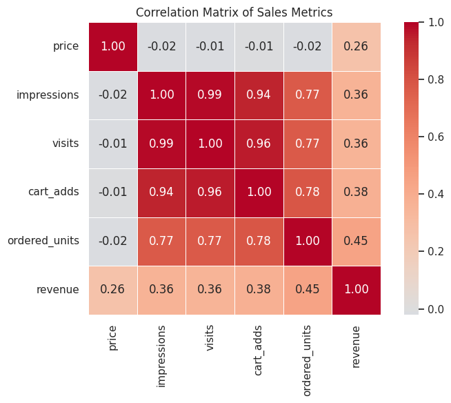
Correlation Between Metrics
[10]:
# Correlation heatmap of numeric metrics
numeric_cols = ["price", "impressions", "visits", "cart_adds", "ordered_units", "revenue"]
correlation_matrix = metrics_df[numeric_cols].corr()

fig, ax = plt.subplots(figsize=(8, 6))
sns.heatmap(correlation_matrix, annot=True, cmap="coolwarm", center=0,
            fmt=".2f", square=True, ax=ax, linewidths=0.5)
ax.set_title("Correlation Matrix of Sales Metrics")
plt.tight_layout()
plt.show()
Enrichment: Simulating Treatment Effects
The package can simulate treatment effects (e.g., A/B test outcomes) by boosting sales for a subset of products starting at a specific date.
[11]:
from online_retail_simulator import enrich

# Apply enrichment using config file (boost sales by 50% for 30% of products starting Nov 15)
enrich_config_path = os.path.join(os.path.dirname(__file__) if "__file__" in dir() else ".", "config_enrichment.yaml")
enriched_job = enrich(enrich_config_path, job_info)

# Load enriched results
enriched_results = load_job_results(enriched_job)
enriched_df = enriched_results["enriched"]
print(f"Applied enrichment to {len(enriched_df)} records")
Applied enrichment to 3000 records
[12]:
# Compare before and after: daily revenue time series
daily_original = metrics_df.groupby("date")["revenue"].sum().reset_index()
daily_original["date"] = pd.to_datetime(daily_original["date"])
daily_original["type"] = "Original"

daily_enriched = enriched_df.groupby("date")["revenue"].sum().reset_index()
daily_enriched["date"] = pd.to_datetime(daily_enriched["date"])
daily_enriched["type"] = "Enriched"

# Plot comparison
fig, ax = plt.subplots(figsize=(12, 6))
ax.plot(daily_original["date"], daily_original["revenue"],
        marker="o", linewidth=2, markersize=4, label="Original", color="#1f77b4")
ax.plot(daily_enriched["date"], daily_enriched["revenue"],
        marker="s", linewidth=2, markersize=4, label="Enriched", color="#2ca02c")

# Mark enrichment start
enrichment_start = pd.to_datetime("2024-11-15")
ax.axvline(enrichment_start, color="red", linestyle="--", alpha=0.7, label="Enrichment Start")

ax.set_xlabel("Date")
ax.set_ylabel("Revenue ($)")
ax.set_title("Daily Revenue: Before vs After Enrichment")
ax.yaxis.set_major_formatter(plt.FuncFormatter(lambda x, p: f"${x:,.0f}"))
ax.legend()
plt.xticks(rotation=45)
plt.tight_layout()
plt.show()

# Print lift metrics
post_start = enriched_df["date"] >= "2024-11-15"
original_post_revenue = metrics_df[metrics_df["date"] >= "2024-11-15"]["revenue"].sum()
enriched_post_revenue = enriched_df[post_start]["revenue"].sum()
lift = (enriched_post_revenue / original_post_revenue - 1) * 100

print(f"\nPost-enrichment period (Nov 15-30):")
print(f"  Original revenue:  ${original_post_revenue:,.2f}")
print(f"  Enriched revenue:  ${enriched_post_revenue:,.2f}")
print(f"  Revenue lift:      {lift:.1f}%")
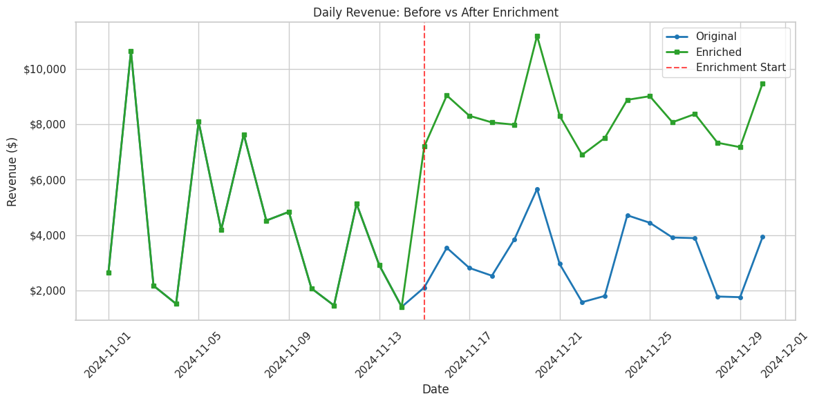
Post-enrichment period (Nov 15-30):
  Original revenue:  $51,291.95
  Enriched revenue:  $132,747.41
  Revenue lift:      158.8%
Next Steps
This overview covers the basics of generating and exploring synthetic retail data. For more details:
Full Documentation: Online Retail Simulator Docs
Configuration Reference: Learn about all available parameters
API Reference: Detailed function documentation
Demo Scripts: See
demo/directory for more examples
Key Functions
# Core simulation
simulate(config_path)         # Generate complete dataset
simulate_products()           # Generate product catalog only
simulate_metrics()            # Generate sales metrics

# Enrichment
enrich(config_path, job)      # Apply treatment effects

# Results management
load_job_results(job)         # Load all results
list_jobs()                   # List saved jobs
cleanup_old_jobs(days=30)     # Clean up old outputs