Download the notebook here!
Interactive online version: ![]()
Portfolio optimization: visualization
This notebook visualizes the minimax regret portfolio selection process. It covers:
Conceptual plots explaining regret and confidence penalization
Running the optimizer on a set of investment opportunities
Visualizing selected initiatives and scenario return bands
Imports
[1]:
import pandas as pd
import numpy as np
import matplotlib.pyplot as plt

from impact_engine_allocate.allocation import (
    MinimaxRegretAllocation,
    calculate_effective_returns,
    preprocess,
    empty_rule_result,
)
Visualization functions
Helper functions for the four plots used in this tutorial.
[2]:
def plot_regret_concept():
"""Illustrates the concept of regret across different scenarios."""
print("--> Generating plot: Conceptual Example of Regret")
initiatives = {
"A": {"best": 50, "med": 30, "worst": 10},
"B": {"best": 45, "med": 35, "worst": 25},
"C": {"best": 40, "med": 38, "worst": 36},
}
scenarios = ["best", "med", "worst"]
scenario_colors = {"best": "green", "med": "orange", "worst": "red"}
fig, ax = plt.subplots(figsize=(8, 5))
width = 0.2
x = np.arange(len(initiatives))
for i, scenario in enumerate(scenarios):
values = [initiatives[k][scenario] for k in initiatives.keys()]
ax.bar(x + i * width, values, width=width, label=scenario.capitalize(), color=scenario_colors[scenario])
ax.set_xticks(x + width)
ax.set_xticklabels(initiatives.keys())
ax.set_ylabel("Return")
ax.set_title("Conceptual Example of Regret")
ax.legend()
plt.grid(True, axis="y", linestyle="--", alpha=0.6)
plt.tight_layout()
plt.show()
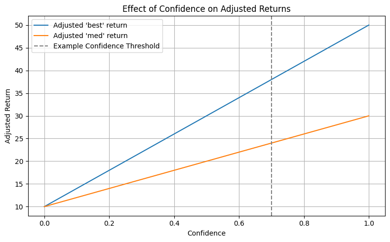
def plot_confidence_penalty_effect():
"""Shows how the effective return is penalized by low confidence."""
print("--> Generating plot: Effect of Confidence on Adjusted Returns")
c = np.linspace(0, 1, 100)
gamma = 1 - c
R_base = {"best": 50, "med": 30, "worst": 10}
plt.figure(figsize=(8, 5))
for scenario in ["best", "med"]:
R_eff = (1 - gamma) * R_base[scenario] + gamma * R_base["worst"]
plt.plot(c, R_eff, label=f"Adjusted '{scenario}' return")
plt.axvline(x=0.7, color="gray", linestyle="--", label="Example Confidence Threshold")
plt.title("Effect of Confidence on Adjusted Returns")
plt.xlabel("Confidence")
plt.ylabel("Adjusted Return")
plt.legend()
plt.grid(True)
plt.tight_layout()
plt.show()
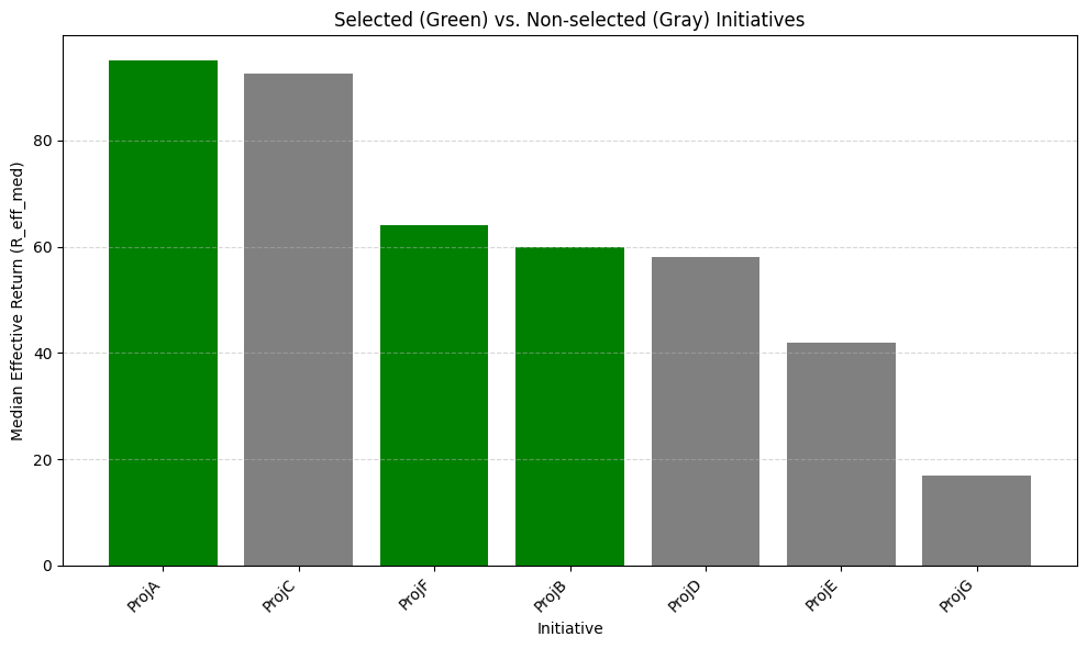
def plot_portfolio_selection(df):
"""Visualizes the selected vs. non-selected initiatives."""
print("--> Generating plot: Selected vs. Non-selected Initiatives")
df_sorted = df.sort_values("R_eff_med", ascending=False)
colors = df_sorted["selected"].map({True: "green", False: "gray"})
plt.figure(figsize=(10, 6))
plt.bar(df_sorted["id"], df_sorted["R_eff_med"], color=colors)
plt.xlabel("Initiative")
plt.ylabel("Median Effective Return (R_eff_med)")
plt.title("Selected (Green) vs. Non-selected (Gray) Initiatives")
plt.xticks(rotation=45, ha="right")
plt.grid(True, axis="y", linestyle="--", alpha=0.5)
plt.tight_layout()
plt.show()
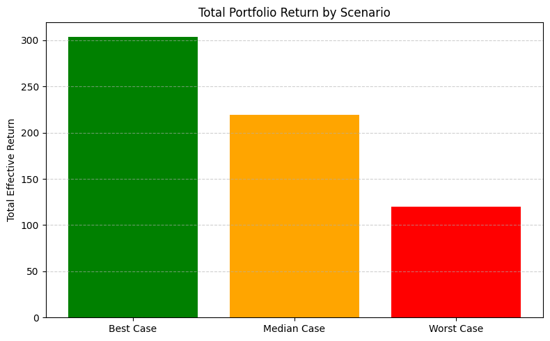
def plot_return_bands(df):
"""Displays the total portfolio return across best, median, and worst-case scenarios."""
print("--> Generating plot: Total Portfolio Return by Scenario")
selected_df = df[df["selected"]]
if selected_df.empty:
print("No initiatives selected, skipping return bands plot.")
return
scenarios = ["R_eff_best", "R_eff_med", "R_eff_worst"]
totals = [selected_df[s].sum() for s in scenarios]
labels = ["Best Case", "Median Case", "Worst Case"]
colors = ["green", "orange", "red"]
plt.figure(figsize=(8, 5))
plt.bar(labels, totals, color=colors)
plt.title("Total Portfolio Return by Scenario")
plt.ylabel("Total Effective Return")
plt.grid(True, axis="y", linestyle="--", alpha=0.6)
plt.tight_layout()
plt.show()
Conceptual plots
Before running the optimizer, we illustrate the two key ideas: regret across scenarios, and how low confidence shrinks effective returns toward the worst case.
[3]:
plot_regret_concept()
plot_confidence_penalty_effect()
--> Generating plot: Conceptual Example of Regret
--> Generating plot: Effect of Confidence on Adjusted Returns
Data and parameters
Define the investment opportunities and optimization constraints.
[4]:
investment_opportunities = [
    {"id": "ProjA", "cost": 100, "R_best": 150, "R_med": 100, "R_worst": 50, "confidence": 0.9},
    {"id": "ProjB", "cost": 80, "R_best": 120, "R_med": 80, "R_worst": 30, "confidence": 0.6},
    {"id": "ProjC", "cost": 120, "R_best": 200, "R_med": 110, "R_worst": 40, "confidence": 0.75},
    {"id": "ProjD", "cost": 50, "R_best": 70, "R_med": 60, "R_worst": 20, "confidence": 0.95},
    {"id": "ProjE", "cost": 90, "R_best": 160, "R_med": 90, "R_worst": 10, "confidence": 0.4},
    {"id": "ProjF", "cost": 60, "R_best": 90, "R_med": 70, "R_worst": 40, "confidence": 0.8},
    {"id": "ProjG", "cost": 40, "R_best": 60, "R_med": 30, "R_worst": 10, "confidence": 0.35},
]

BUDGET = 250
CONFIDENCE_THRESHOLD = 0.5
MIN_WORST_RETURN = 80
Run optimization
[5]:
print(f"Parameters: Budget={BUDGET}, Confidence>={CONFIDENCE_THRESHOLD}, Min Worst Return={MIN_WORST_RETURN}")

processed = preprocess(investment_opportunities, CONFIDENCE_THRESHOLD)
if not processed:
    results = empty_rule_result("No Eligible Initiatives", "minimax_regret")
else:
    solver = MinimaxRegretAllocation()
    results = solver(processed, BUDGET, MIN_WORST_RETURN)

print(f"Status: {results['status']}")
if results["status"] == "Optimal":
    print(f"Minimized Max Regret: {results['objective_value']:.2f}")
    print(f"Selected Initiatives: {results['selected_initiatives']}")
    print(f"Total Cost: {results['total_cost']:.2f}")
Parameters: Budget=250, Confidence>=0.5, Min Worst Return=80
Status: Optimal
Minimized Max Regret: 7.50
Selected Initiatives: ['ProjA', 'ProjB', 'ProjF']
Total Cost: 240.00
Visualize results
Build a DataFrame with effective returns and selection flags, then plot the portfolio selection and scenario return bands.
[6]:
if results["status"] == "Optimal":
    processed = calculate_effective_returns(investment_opportunities)
    initiatives_df = pd.DataFrame(processed)
    eff_returns_df = pd.json_normalize(initiatives_df["effective_returns"]).rename(columns=lambda x: f"R_eff_{x}")
    initiatives_df = initiatives_df.drop("effective_returns", axis=1).join(eff_returns_df)
    initiatives_df["selected"] = initiatives_df["id"].isin(results["selected_initiatives"])

    plot_portfolio_selection(initiatives_df)
    plot_return_bands(initiatives_df)
else:
    print(f"Optimization did not find an optimal solution: {results['status']}")
--> Generating plot: Selected vs. Non-selected Initiatives
--> Generating plot: Total Portfolio Return by Scenario